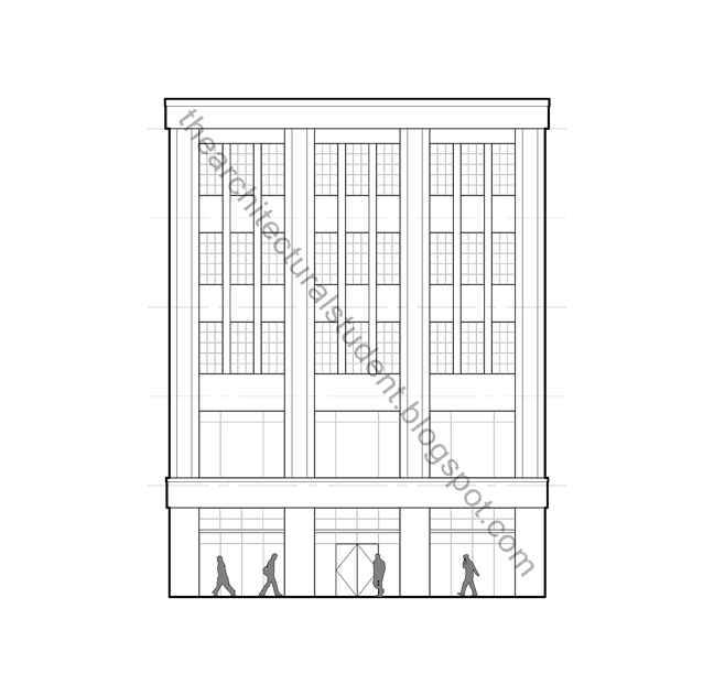
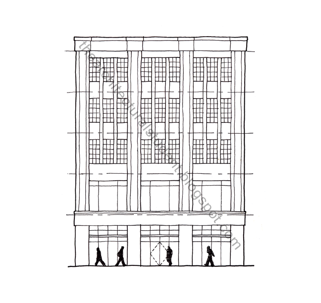
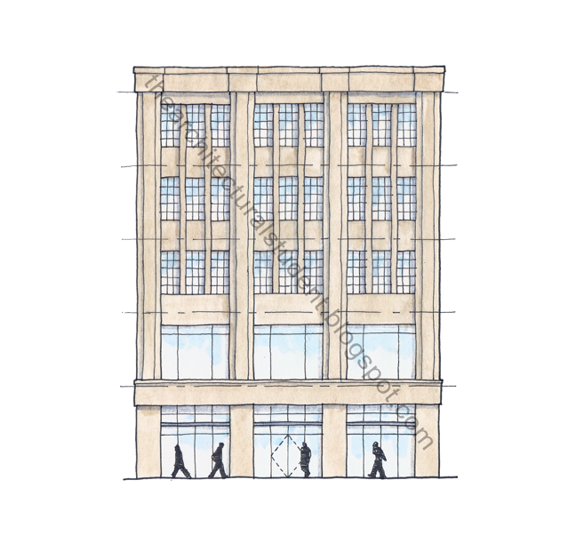
Lineweights in CAD can be a bit difficult until you learn the tricks. At my school they taught us that you can set up lineweights in two ways; by layer and by color. You can also use both to setup lineweights, though sometimes they can cause issues when printing. This tutorial goes through the basics of setting up your lineweights in AutoCAD using these two methods.
To set your lineweights by layer you need to open the Layer Properties window.
Now you need to set up your layers. Add as many layers as you want lineweights, name the layers so you know which lineweight is which, then set the lineweight of that layer to the desired lineweight.
This is the simplest way to set the lineweights of your drawing. The hardest part is to be sure that each line is the proper weight as you are drafting. To visually see the different lineweights, click on the show/hide lineweight button is pressed on the bottom of the window.
Using simple lineweights like this, you do not need to worry about the plotstyle since all the layer colors are white / black (depending on your background color). Once colors are selected for each layer, you will need to edit the plot style table so line colors will be correct. If you are having issues with color, try selecting the greyscale plot style table. It is only a quick fix, though I will discuss layers colors and plot styles in the next section to help you get it to look correct.
Using layer colors can make setting up lineweights much easier. If you work in a firm, ask a fellow employee to explain the standards the firm uses and use those for your school work. This will make your life easier and avoid confusion. Of course you can always create your own simple styles like I have.
To start creating your own, we need to talk about AutoCAD colors. There are many colors in AutoCAD and to create different colors, there are only a few that are generally used as to not make it so difficult. The AutoCAD Colors are below.
The colors highlighted above are colors 1-9 and are the ones generally used. The best approach is to create an order of layer colors, from the smallest lineweight to the largest lineweight and keep this hierarchy in mind when you draft in AutoCAD. The lineweight of the layer (as seen in the previous section) will remain default while the plotstyle file will dictate the lineweight and printed color of each color you select. Make sense? Basically, the colors, no matter which you select, you can have them print in any color and set any color to be a certain weight. More on plotstyles later.
At this point you should understand the hierarchy of lineweights used in an architectural drawing so begin creating layers of different colors, from colors 1-9. I use the following, from the smallest to the largest:
Yellow is reserved for text and dimensions only, while grey (color 9) is reserved for furniture, people, etc and usually is printed grey rather than black. You can always use blue for furniture and people rather than grey depending on what you are going for and print it black and use grey for something else. It is up to you to figure out your own style. I do recommend using yellow for text and reserve grey for something you might want grey.
Next, set up your layers much like you did before. This time make sure the lineweights are set to default so the plotstyle lineweights will be used.
Now that you have your layers set up, now get into the plot window, click on the plot style table and select new.
Now there are a few things you need to click through. Since you are going to customize your plot styles, in the first window you will click on Start from scratch and click next.
Next you need to name your new plot style and click next.
Lastly you will click on the Plot Style Table Editor button in order to customize your lineweights which will open the editor for you.
The Plot Style Table Editor window is where you set the print color and the lineweight of each color. Select each color you used on the left and set its color and lineweight on the right. You don't need to worry about the rest if you are a novice.
Once you are done save and close the Plot Style Table Editor. You can update this new plot style file whenever you want. My trick is to create a Plot Style for each scale or group of scales you are printing. This way the lineweights appear correct no matter the scale and all you have to do is set the plot style to the layout. Once you have done a couple test prints, you will not have to think about your lineweights and just simply use the colors to dictate which ones are smaller and bigger. It is much like assigning a color to your drafting leads and when they print, they print in the correct weight so you can see the lineweight by color rather than by thickness as you draft. As you complete a layout and you would like to check your work, you can see my other tutorial on how to see Plot Styles and Lineweights in AutoCAD's Layout Tab. Below you can see a before and after from the tutorial.
I hope you have found this tutorial helpful. AutoCAD can be unfriendly when it comes to printing and these tips can help save you time and effort.
Lineweights by Layer
To set your lineweights by layer you need to open the Layer Properties window.
Now you need to set up your layers. Add as many layers as you want lineweights, name the layers so you know which lineweight is which, then set the lineweight of that layer to the desired lineweight.
This is the simplest way to set the lineweights of your drawing. The hardest part is to be sure that each line is the proper weight as you are drafting. To visually see the different lineweights, click on the show/hide lineweight button is pressed on the bottom of the window.
Using simple lineweights like this, you do not need to worry about the plotstyle since all the layer colors are white / black (depending on your background color). Once colors are selected for each layer, you will need to edit the plot style table so line colors will be correct. If you are having issues with color, try selecting the greyscale plot style table. It is only a quick fix, though I will discuss layers colors and plot styles in the next section to help you get it to look correct.
Lineweights by Color
Using layer colors can make setting up lineweights much easier. If you work in a firm, ask a fellow employee to explain the standards the firm uses and use those for your school work. This will make your life easier and avoid confusion. Of course you can always create your own simple styles like I have.
To start creating your own, we need to talk about AutoCAD colors. There are many colors in AutoCAD and to create different colors, there are only a few that are generally used as to not make it so difficult. The AutoCAD Colors are below.
The colors highlighted above are colors 1-9 and are the ones generally used. The best approach is to create an order of layer colors, from the smallest lineweight to the largest lineweight and keep this hierarchy in mind when you draft in AutoCAD. The lineweight of the layer (as seen in the previous section) will remain default while the plotstyle file will dictate the lineweight and printed color of each color you select. Make sense? Basically, the colors, no matter which you select, you can have them print in any color and set any color to be a certain weight. More on plotstyles later.
At this point you should understand the hierarchy of lineweights used in an architectural drawing so begin creating layers of different colors, from colors 1-9. I use the following, from the smallest to the largest:
blue - white - green - red - cyan - magenta
Yellow is reserved for text and dimensions only, while grey (color 9) is reserved for furniture, people, etc and usually is printed grey rather than black. You can always use blue for furniture and people rather than grey depending on what you are going for and print it black and use grey for something else. It is up to you to figure out your own style. I do recommend using yellow for text and reserve grey for something you might want grey.
Next, set up your layers much like you did before. This time make sure the lineweights are set to default so the plotstyle lineweights will be used.
Plot Style Table
Now that you have your layers set up, now get into the plot window, click on the plot style table and select new.
Now there are a few things you need to click through. Since you are going to customize your plot styles, in the first window you will click on Start from scratch and click next.
Next you need to name your new plot style and click next.
Lastly you will click on the Plot Style Table Editor button in order to customize your lineweights which will open the editor for you.
The Plot Style Table Editor window is where you set the print color and the lineweight of each color. Select each color you used on the left and set its color and lineweight on the right. You don't need to worry about the rest if you are a novice.
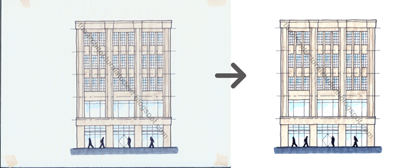
Once you are done save and close the Plot Style Table Editor. You can update this new plot style file whenever you want. My trick is to create a Plot Style for each scale or group of scales you are printing. This way the lineweights appear correct no matter the scale and all you have to do is set the plot style to the layout. Once you have done a couple test prints, you will not have to think about your lineweights and just simply use the colors to dictate which ones are smaller and bigger. It is much like assigning a color to your drafting leads and when they print, they print in the correct weight so you can see the lineweight by color rather than by thickness as you draft. As you complete a layout and you would like to check your work, you can see my other tutorial on how to see Plot Styles and Lineweights in AutoCAD's Layout Tab. Below you can see a before and after from the tutorial.
I hope you have found this tutorial helpful. AutoCAD can be unfriendly when it comes to printing and these tips can help save you time and effort.


