Showing posts with label Tutorials. Show all posts

Sunday, November 8, 2015

Tutorial: Drafting Necessities

Drafting Leads


Since everyone uses leads with varying amounts of pressure and the need for depth in architectural plans and renderings resulted in the needs for many different types of leads. B Leads are darker and as you get to 9B they become more and more charcoal like. When starting to draft, always use an H, generally 4H to 9H. They are lighter in shade, with a harder lead that erases the easiest. Just be careful not to write/draw too hard, it will indent the paper resulting in issues with paper texture and eraser. You can also get a ghosting affect when shading.


Drafting leads can be expensive, so get a combo pack or buy a few different ones. F's tend to be crappy lead, so instead opt for an HB, F's work well for quick sketches though. If I am using only a few line weights in a drawing I will use a light 2H for the construction lines (very light hand pressure), a harder 2H for the smaller line weights (more hand pressure) a medium light 2H (a bit more pressure) and a 2B for dark linework. You can also use a harder 4H for an additional lighter line weight for the construction lines. Generally you need at least 3 line weights and as your drawing gets bigger, adding additional B leads will increase the detail and intensity of your drawing. For additional line weights, add a 4B, 5B or whatever works for you. Leads right next to each like a 2B and a 3B are only slightly different so jump leads by at least 2 or 3 to get more definitive line weights. Each lead you use will also have at least two line weights itself. If in doubt, test on scrap paper of the same kind of paper you are using before you start adding line weights to your final drawing.


Lead Holders (Clutch Pencil)


Lead Holder or Clutch Pencil

Leads are used with a lead holder, also referred to as a clutch pencil. It is much faster to have a few lead holders so you can have a different lead in each clutch pencil. If you can afford it, start with three lead holders and three types of leads or if you can't, a couple different leads and a holder will suffice. There are many to choose from. Some even have a rotating cover so you can select the lead in the holder making drafting easier. Others have colored caps to identify which one has which lead.

Leads


2mm Leads

Leads come in packs of 2, 12 or more. Be sure to choose your leads carefully and know which ones you are buying. I generally use 2H, HB, 2B and 4B at the very least but remember we are all different so pick what works for you. Try with drawing pencils first before you spend money on leads to what might work for your hand. Always use at least 3 lineweights and remember how far viewers will be away from the piece. Leads also come in different colors depending on what you will be working on.

Sharpeners


The leads can be sharpened with a Rotary Lead Pointer which is the quickest way. You can also use a small sharpener, a piece of sandpaper or even a scrap piece of paper. Some clutch pencils also come with a pencil sharpener built in the button. A lead sharpener has built in holes to set the lead length so you can either sharpen it to a point or a very sharp point. be sure to clean the lead after you sharpen it. A lead holder has a built in lead pointer pad, they get dirty fairly quickly, but you can get refills. A rag or an old towel works in a jamb if you're careful.

Lead Pointer - src


Erasers 

White Eraser

On vellum, a white eraser such as a Staedler Mars erases the best, however on paper, a Papermate Pink Pearl Eraser often can work the best. When you are working on the details of your drawing, it can be hard to erase so use an Erasing Shield. You simply put one of the holes of the shields over your drawing to protect it and erase through the shield.

Erasing Shield

Drafting Must Haves


Scale


Recommended list of things that every Architecture Student should never be without. Scale - Both Engineering and Architectural. You'll need either a parallel drawing board, a T-square and a drafting board, or drafting table with a parallel ruler or T-Square, one large and one small of both a 45 and 60 degree triangle. An adjustable triangle can also be helpful if you will be doing a lot of hand drafting. I have one of those drafting machine drawing boards which is great for rendering and drafting.

Drafting Triangles


Drafting with Pen


If you decide to draft with pen, a prismacolor or Sakura Micron pens are not design for drafting but are great for sketching and diagramming with. There are drafting pens out there. The refillable ones are very expensive while there are also cheaper disposable drafting pens. It is easier and cheaper to use pencil, but nothing beats a nice drafted ink line on velum.

Ko-I-Noor Rapidograph Drafting Pens
RoTring Tikky Graphic Fineliner


Hand Rendering Tutorial


Once you have learned about line weights using either pen or pencil, you can check out the Hand Rendering Elevations Tutorial. The tutorial is based on tracing computer generated elevations, which I generally do for class, however, it explains the different methods of coloring and layer colors using trace or velum which will be helpful for conceptual sketching and graphic conceptualization of your ideas.

Pen and marker on trace

Further Information


The best book to get for your architecture collection is Francis D. K. Ching's book, Architectural Graphics currently in its fifth edition. I have this book in my collection, It goes through leads, paper, and drawing technique in the first chapter. The rest of the book is how to draft architecturally. Plans, sections, elevations, perspectives, you name it, it has it. I use it for reference every now and again even now. Buy it from Amazon from a third party seller either 'New' or 'Like New' condition which will save you a bit of money. Always check seller reviews.


Pencil and Lead Tutorial


If you are new to the architecture field or drawing in pencil and are interested in knowing more about pencils, their different leads and types, check out my Tutorial on Pencils and Leads. In this tutorial, I explain different lead types, different pencils, their quality and the uses for each.

Saturday, September 26, 2015

Tutorial: Indesign Tips for Architecture Boards

Intro


Over the many years of creating architectural boards for school there are a few main issues I noticed while learning to create them. Scale was always the biggest issues with students showing a section, plan or rendering too small to be legible during their presentation. This is also true for vignettes or renderings outlining the building's concept. Being Consistent in the creation of your presentation is also important. When the boards come together they need to belong. Font sizes should also be consistent and drawings should be close to the same saturation. Being subtle is the best approach so watch your picture opacity. This will start to create Visual Interest within your boards. Using large Text with your concept words is a good way to reinforce them during your presentation and help tie things together. Knowing what software to use and how to use it is also important in order to create successful drawings and renderings. 

Scale


One issue that every architect and architecture student faces from time to time is drawing and picture size. If your drawings or pictures/renders are too small, how can your critics see what your are talking about? Pay careful attention and print out text font samples so you can see what might be readable. Ask a classmate what they used or what they think about yours. When doing final drawings, always check your lineweights. Many times I have seen drawings that either used too thick or too thin lineweights (click here for The Architecture Student's tutorial on Setting up Lineweights in CAD). Always know whereabouts your audience will be standing/sitting and create your boards such that they can clearly see the main ideas from there. Portfolios are much different so be sure to make everything big enough when it comes to presentation boards.

Consistency


Use the same size fonts for each type of text (i.e. title, board text and labels). You can set these fonts up either in character or paragraph styles. I use the paragraph style myself. It is pretty easy to set up and once you do, it makes editing and adding things that much quicker. It is also good to use some sort of color or graphic that creates a coordination and belonging between your boards.

Visual Interest


After you figure out font stuff, come up with an idea that will be a theme. A box behind your section titles is one way. Linear lines that connect boards together, or a background picture at a very low opacity are also great ideas. Chris P made the following tutorial on a quick and dirty background for his review boards. Make it your own, but he a bit subtle.


Photographs


Pictures of models, precedents or renderings are quite important to your concept, their opacity are just as important. Pictures generally are too dark and contrasting than you would like. I have seen it again and again on review and presentation boards. When pictures and renderings are more subtle or relaxed, the more pleasing the layout and concept. When I input a render, plan, section or picture, I automatically set the opacity to 90%. If the picture is especially dark, I will go to 85% or lower. Implying color rather than saturating it can make things blend together and be more soothing to the eye. Black shouldn't be at a 100% opacity unless it is your intent. Solid black also has issues when printing, saturating the paper possibly leading to paper wrinkles and can mark up the rest of your boards when you print. I generally use 90% or 75% depending on if its a section, plan, picture, etc. It is important that the boards work together, don't worry about colors changes but it is a good idea to continue to use the same diagram colors throughout to help with consistency and visual appeal.

Text


Text Size - src
Generally students end up making their test too small so be careful. Some things you don't want anyone to read from afar and some that you do. No one will read a paragraph from pretty far away so keep your large text your concept words and drawing/section titles. For text I generally keep it set to black. I also keep my text opacity at 95%, anything lower goes into grey, which can start to become difficult to read. Big fonts can also be at 25% or even lower. It comes out a light grey, easy to read and not overpowering. Play around with it and keep a theme of some sort.

More from the Architecture Student Blog


Additional information

A lot of the tips I've learned on computer rendering I read in Bradley Cantrell and Wes Michaels' book, Digital Drawing for Landscape Architecture: Contemporary Techniques and Tools for Digital Representation in Site Design. Even though it is for landscaping, it outlines the requirements and techniques for Photoshop rendering beautifully. Look for used or new books from an amazon seller since they are generally cheaper than Amazon even with shipping. Always be sure check seller reviews!


Examples

Check out our collection on Pinterest to get inspired.


Wednesday, August 5, 2015

Tutorial: Software for Architects


The creation of architecture drawings, renderings, portfolios and boards can involve many different types of software and there is software than can can meet all your needs. This tutorial outlines the most prevalent ones and how they might be used. Software is generally broken down into vector linework and image processing. Scale linework is important as a basis of any rendering or drawing. Then diagramming, context, habitation, and its environment can be added.

Cultural Community Hub
by KenepaStudio

There are many different software you can use, different add-ons and software versions and possible ways to use them together to create successful designs. The most prevalent software used for architectural design is AutoCAD, Illustrator, InDesign, Photoshop, Revit, Rhino, and SketchUp. Designs typically start to scale, either 2D or 3D and then imported via pdf into another program for tweaking/diagramming/processing, then placed in InDesign for printing.

AutoCAD


AutoCAD is a commercial software application for the creation of 2D and 3D computer-aided design (CAD) and drafting. Released in 1982 by Autodesk Inc., it continues to be the most widely used CAD program in the world. Typically students learn to use AutoCAD in high school or in college, where they learn to draft designs such as buildings or machinery parts. It is usually a prerequisite for college design degrees. AutoCAD Architecture is a version of AutoCAD that is created especially for architects. It has features that allow architects to do a more efficient drafting, creating designs and documents familiar to them. It has the same platform as AutoCAD that makes it easier for experienced architects to understand. There are other CAD programs out there, but remember to learn the version that will help you get a job after graduation. Many firms only use Revit nowadays, so learn and use the software to help you get the job you want.

I personally have used AutoCAD for all my plans, drawings, sections, etc. in school as it is free for students to use and I didn't have time in my schedule to learn another one. Once I have a hard-lined drawing, I use Photoshop or Illustrator to put the final touches on them. Lineweights in AutoCAD can be difficult to set and confusing to use, however Illustrator will allow you to more easily change them and you can add in textures, colors, poché, etc. more easily than you can in AutoCAD. Newer versions will likely make it easier, but use the programs you know to get the result you want.

Indesign


InDesign - src

InDesign is a vital piece of software for any architect. It is used for the creation of pdfs that can be used to post things online, create portfolios or to create architecture boards. Definitely learn this software and if you can, take a course at school or watch videos online. You can set up font types/sizes, page master pages with page numbers, helping increase productivity and document consistency. The software also gives you the ability to package your files together and bring them with you so you can work at school or at home without the hassle making sure you copy each separate file and take it with you. As a student, you can purchase Adobe Creative Cloud for about $20 a month plus tax and it is definitely worth the investment. It will automatically update, you can save your work online on Bēhance and you can also save your screen settings, all of which increases your productivity and exposure as a designer. The non-student version of the Creative Cloud is $30 a month plus tax.

Illustrator


Illustrator

Illustrator can be used for many different things; the creation of diagrams, adjusting of the lineweights of vector files (CAD, SketchUp  or Revit pdfs) and the creation of renderings. I personally learned this piece of software late and I regret it, especially after all those hours I spent fighting with CAD to get the lineweights right. I and others have also found that the hatching in CAD tends not to print correctly, but with Illustrator you can add wall poché, textures or people silhouettes much easier and with less errors than in CAD. It also works with Revit plans or 2D pdf files from Sketchup which helps a lot with 3D building diagrams, sections, elevations or plans. You can also link Photoshop files into the Illustrator files or visa verse to help you make superb renderings. I highly recommend creating your diagrams in Illustrator and saving them as pdfs so they can be viewed on any computer, and easily placed into Indesign files or printed. Creating diagrams over plants or sections in Illustrator can also be easier since the pen tool will snap over line endpoints or 'anchors'. You can download this as part of your Adobe Cloud membership.

Photoshop


 Photoshop - src

When creating renderings, whether it is a section, elevation or plan, knowing how to use Photoshop is absolutely vital. Definitely take a class at school or watch tutorials online. Photoshop is usually used in conjunction with other software like CAD, Revit, SketchUp, or Illustrator. It is used for image processing, adding textures (like brick, stone, etc.), landscape, people, a sky, etc. You can use it for just about everything, once you learn how to use it. It is also a great way to fix and edit scans of your work and create vignettes, etc. Also part of an Adobe Creative Cloud membership.

See more from the Architecture Student Blog:
Learn to create an architectural section in Photoshop
Adding a sky in Photoshop

AutoDesk Revit


Revit - src

Revit is programmed for building information modeling or BIM, which is the key for a sustainable design and coordination. The changes that you make will be automatically coordinated throughout the project that you are working on. This helps architects make a consistent and complete project. The features are easy to understand to help you start a complete, consistent and error free design and is based on AutoCAD. This program is much easier than AutoCAD to create sections, plans, etc. and most firms use this software so you should definitely learn it (ask around). You can also create 3D renderings from this software which can be a lifesaver when working on studio projects. Students can download and use Autodesk Revit for free, however it is not for commercial use so when files are used, they are saved as a student version. Commercial users can download a trial version.

Rhinoceros 3D (Rhino)


Rhino - src

Developed by Robert McNeel & Associates, Rhinoceros 3D (Rhino) is a stand-alone, commercial NURBS-based 3D modeling tool. It is commonly used for industrial design, architecture, marine design, jewelry design, automotive design, CAD/CAM, rapid prototyping, reverse engineering as well as in the multimedia and graphic design industries. Rhinoceros 3D gained its popularity in architectural design in part because of the Grasshopper plug-in (parametric modeling tool) for computational design. There are also several other rendering plug-ins developed by McNeel: Flamingo (raytrace), Penguin (non-photorealistic), Bongo and Brazil (advanced). There are over 100 third-party plug-ins available.

In school, Rhino is typically used to figure out 3D issues, however it can be used to take a CAD 2D file and quickly import it and create a 3D section axonometric for example. Rhino’s increasing popularity is based on its diversity, multi-disciplinary functions, low learning-curve, relatively low cost, and its ability to import and export over 30 file formats, which allows Rhino to act also as a ‘converter’ tool between programs in a design workflow.

Sketchup


SketchUp - src

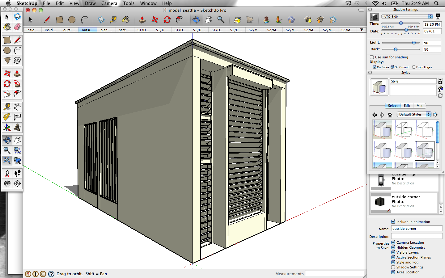
SketchUp allows the user to quickly and easily make 3D designs. It can be downloaded for free however many of its export features are disabled. SketchUp Professional or Pro has all the program's functions and comes with SketchUp Make, which creates plans, sections, etc. for scale printing of your 3D design. Buying SketchUp Pro is quite expensive for a commercial version. A student license is a mere $49 at the time of this article though you can likely work on it at school for free. If your computer has a good graphics card and plenty of ram, it is definitely worth purchasing. Be warned that you must submit your information through a third party in order to receive the discount but your license will work for a year from purchase.

Printing to scale is quite difficult from SketchUp without using Make, however you can export a design into a drawing or .dwg file can use this file in CAD or Revit to start your design or visa versa. You can also download people, buildings, furniture, vehicles, etc from the SketchUp 3D Warehouse which can be great for the creation of design vignettes or renderings of your designs. Perfecting a rendering in SketchUp alone is also very difficult and there are many add-ons that can help you a lot with your design. In school, I typically use SketchUp to create a 3D version of my building, export pictures, print them and trace over them, embellishing the vignette, coloring, scanning and using PhotoShop to overlay the SketchUp shadows, textures, etc. Screenshots of SketchUp models tend to be over-saturated and the textures you can use also are very cartoon-like however it can become a vital step in your design process.


Additional Information on Computer Rendering

If you are looking for a book on computer rendering, Bradley Cantrell and Wes Michaels' book, Digital Drawing for Landscape Architecture: Contemporary Techniques and Tools for Digital Representation in Site Design, even though it is for landscaping outlines the requirements and techniques for Photoshop rendering beautifully. Look for used or new books from an amazon seller since they are generally cheaper than Amazon even with shipping. Always be sure check seller reviews!


Saturday, December 28, 2013

Tutorial: Pencils and Leads

Pencil Grading Chart
Pencil cores are generally made of graphite mixed with a clay binder which creates easily erased grey or black marks. Graphite pencils are used for both writing and drawing which provides a durable mark, resistant to moisture, ultraviolet radiation, and aging.

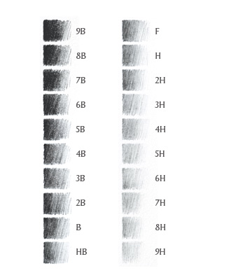
Pencils come with either numbers or letters on them. From the image right, we can see that the letter B signifies the blackness of the pencil, the letter H signifies the hardness, and the letter F stands for 'fine.' In the United States, we use a different system using numbers to identify pencil hardness, ranging from #1 to #4. A #2 pencil, all to familiar to those that grew up in the US is the equivalent to the European HB.

The B's get darker and as you get to 9B they become more and more charcoal like. B's are tougher to erase than H leads so remember what type of sketch or drawing you are doing. Quick sketches using a B lead are very vibrant with more emotion then with an H lead. H leads are harder and make then easier to erase. Just remember that the harder you press down, they will indent the paper making them tough to erase, just watch the amount of pressure you use. I tend to use an H lead, such as a 2H, 4H, or even 6H to start my drawings, sketch it out, and use an HB or a B lead to go over it, just remember B leads are tougher to erase. You can always use as many leads as you want and layer over it. You can even use the leads to color your drawing or sketch using the leads. A 4H lead for example is very grey, I sometimes use this for metal, while an HB can be used for shadows with a 6B can be used for deep shadows or whatever you want to be black. Look at the image above again and you will see what I mean.

I recommend buying a cheap electric pencil sharpener and a few pencil sharpeners to make sketching easier. A scrap piece of paper can also work well to help keep the ideal edge or point on your pencil. Using conventional leads to draft can be difficult, but not impossible. It is better to use a lead holder and sharpener, as the leads are much sharper which gives you a cleaner, sharper drawing. You can also use lead holders for sketching and drawing. Mechanical pencils can also be used for drafting, however I prefer to use them to do homework as they don't need sharpening.

Beginners

If you are just starting to draw, you might one to pick up just a few pencils to get a feel for them. You don't necessarily need pencils of each type, opt to get a few: 4B, 2B, HB, 2H, 4H will suffice and will save you a little money. A combo pack or starter set gets you the best bang for your buck, just be sure you check which leads they come with. As an architecture student, you probably want ones in the middle (6B through 4H), though a 9B you might like for some quick sketches now and again.

Staedtler Starter Set
Quality

The last thing that you should be aware of is pencil quality. If you buy pencils that are not high quality, the leads are more prone to break with a wood casing of questionable quality. I have been drawing for about 30 years and I recommend using Staedtler pencils, they are my favorite brand. However, Koh-i-Noor, Faber-Castell, Derwent, and Turquoise are all my second choices. General pencils I found not too be too great however they make great charcoal pencils. To start, buy a pencil set of some sort and play with them. Once you figure out which leads you prefer, you can always buy replacement pencils later as you use them up.

Staedler Pencil Set


Jumbo Pencils

Other then the standard type of pencil, they do have thick lead pencils. They might look like they are the kind that children use to learn to write since they are thicker and easier to grip. I find this type of pencils quick comfortable to use and great for sketching. The thick leads are great for sketching, especially quick sketches aimed at capturing the feeling of what you are drawing. Koh-i-Noor makes triangular ones which are very comfortable to hold but you will need to sharpen them with a knife. Faber Castell makes some that are round and thicker referred to as their Jumbo pencils.They are designed to be used with those jumbo pencil sharpeners we used as kids.

Koh-i-Noor Triograph Pencils

Faber Castell Jumbo
Woodless Pencils

Another type of pencil is the woodless pencil. Instead of having wood, the whole pencil is a lead. They can be expensive, though they are similar to using charcoal and you can use the edge of it for gestures. They can be messy to use, I recommend buying something in the 4B to 2H range. If you get a 9B, it will be tough to use as it will smudge easily. These type of pencils are great for quick sketches. Careful how you store them, they can break much easier than a wood pencil.

Woodless Pencils
Storage

Personally, I have all my pencils in a Yasutomo Niji pencil Roll. This way I have easy access to whichever pencil I need while working. I have many types of pencils, a set of Staedtler pencils, some woodless pencils, some jumbo pencils, blenders, a few erasers (pink, white, wood and mechanical eraser) and a mechanical pencil for good measure (i.e. for taking notes, doing homework ), or writing something down). Check out my pencil roll below.


You can also store them in a pencil bag or case. You can also just keep them in the original tin, if you purchase a pencil set. Use whatever works for you. Hunt around your local or online art supply store to see what might work for you. I use Amazon myself.

Drafting

Drafting leads are a bit different and you'll need some additional supplies. Check out our Tutorial on Drafting Necessities. If you are looking for information on drafting techniques and workflows, please see our Hand Drafting Tutorial.

Pencil Textures

Now that you know all about pencil leads. Check out the following video that will show you how to use your pencils to create basic textures in your drawings.


I hope you found this post informative. Please post any questions or comments below.

Tutorial: Pencils and Leads

Pencil Grading Chart
Pencil cores are generally made of graphite mixed with a clay binder which creates easily erased grey or black marks. Graphite pencils are used for both writing and drawing which provides a durable mark, resistant to moisture, ultraviolet radiation, and aging.

Pencils come with either numbers or letters on them. From the image right, we can see that the letter B signifies the blackness of the pencil, the letter H signifies the hardness, and the letter F stands for 'fine.' In the United States, we use a different system using numbers to identify pencil hardness, ranging from #1 to #4. A #2 pencil, all to familiar to those that grew up in the US is the equivalent to the European HB.

The B's get darker and as you get to 9B they become more and more charcoal like. B's are tougher to erase than H leads so remember what type of sketch or drawing you are doing. Quick sketches using a B lead are very vibrant with more emotion then with an H lead. H leads are harder and make then easier to erase. Just remember that the harder you press down, they will indent the paper making them tough to erase, just watch the amount of pressure you use. I tend to use an H lead, such as a 2H, 4H, or even 6H to start my drawings, sketch it out, and use an HB or a B lead to go over it, just remember B leads are tougher to erase. You can always use as many leads as you want and layer over it. You can even use the leads to color your drawing or sketch using the leads. A 4H lead for example is very grey, I sometimes use this for metal, while an HB can be used for shadows with a 6B can be used for deep shadows or whatever you want to be black. Look at the image above again and you will see what I mean.

I recommend buying a cheap electric pencil sharpener and a few pencil sharpeners to make sketching easier. A scrap piece of paper can also work well to help keep the ideal edge or point on your pencil. Using conventional leads to draft can be difficult, but not impossible. It is better to use a lead holder and sharpener, as the leads are much sharper which gives you a cleaner, sharper drawing. You can also use lead holders for sketching and drawing. Mechanical pencils can also be used for drafting, however I prefer to use them to do homework as they don't need sharpening.

Beginners

If you are just starting to draw, you might one to pick up just a few pencils to get a feel for them. You don't necessarily need pencils of each type, opt to get a few: 4B, 2B, HB, 2H, 4H will suffice and will save you a little money. A combo pack or starter set gets you the best bang for your buck, just be sure you check which leads they come with. As an architecture student, you probably want ones in the middle (6B through 4H), though a 9B you might like for some quick sketches now and again.

Staedtler Starter Set
Quality

The last thing that you should be aware of is pencil quality. If you buy pencils that are not high quality, the leads are more prone to break with a wood casing of questionable quality. I have been drawing for about 30 years and I recommend using Staedtler pencils, they are my favorite brand. However, Koh-i-Noor, Faber-Castell, Derwent, and Turquoise are all my second choices. General pencils I found not too be too great however they make great charcoal pencils. To start, buy a pencil set of some sort and play with them. Once you figure out which leads you prefer, you can always buy replacement pencils later as you use them up.

Staedler Pencil Set


Jumbo Pencils

Other then the standard type of pencil, they do have thick lead pencils. They might look like they are the kind that children use to learn to write since they are thicker and easier to grip. I find this type of pencils quick comfortable to use and great for sketching. The thick leads are great for sketching, especially quick sketches aimed at capturing the feeling of what you are drawing. Koh-i-Noor makes triangular ones which are very comfortable to hold but you will need to sharpen them with a knife. Faber Castell makes some that are round and thicker referred to as their Jumbo pencils.They are designed to be used with those jumbo pencil sharpeners we used as kids.

Koh-i-Noor Triograph Pencils

Faber Castell Jumbo
Woodless Pencils

Another type of pencil is the woodless pencil. Instead of having wood, the whole pencil is a lead. They can be expensive, though they are similar to using charcoal and you can use the edge of it for gestures. They can be messy to use, I recommend buying something in the 4B to 2H range. If you get a 9B, it will be tough to use as it will smudge easily. These type of pencils are great for quick sketches. Careful how you store them, they can break much easier than a wood pencil.

Woodless Pencils
Storage

Personally, I have all my pencils in a Yasutomo Niji pencil Roll. This way I have easy access to whichever pencil I need while working. I have many types of pencils, a set of Staedtler pencils, some woodless pencils, some jumbo pencils, blenders, a few erasers (pink, white, wood and mechanical eraser) and a mechanical pencil for good measure (i.e. for taking notes, doing homework ), or writing something down). Check out my pencil roll below.


You can also store them in a pencil bag or case. You can also just keep them in the original tin, if you purchase a pencil set. Use whatever works for you. Hunt around your local or online art supply store to see what might work for you. I use Amazon myself.

Drafting

Drafting leads are a bit different and you'll need some additional supplies. Check out our Tutorial on Drafting Necessities. If you are looking for information on drafting techniques and workflows, please see our Hand Drafting Tutorial.

Pencil Textures

Now that you know all about pencil leads. Check out the following video that will show you how to use your pencils to create basic textures in your drawings.


I hope you found this post informative. Please post any questions or comments below.

Friday, August 2, 2013

Tutorial: Hand Rendering Elevations

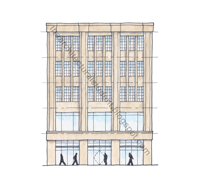
Hand Rendered Elevation
Elevations are an important part of architectural design. There are many ways to create elevations. You can use Sketchup, AutoCAD, Revit or one of the many other rendering programs out there. Creating a three dimensional model for elevations is very time consuming and creating a two dimensional elevations in AutoCAD also requires a lot of time and effort to get the right textures and line weights, much less taking the time to render them in Photoshop. Thus, the quickest way to create an elevation is to complete them by hand. This way you can also choose the detail of the rendering depending on the amount of time you have as well as work through elevation iterations to define your ideas without the hassle of computer rendering.

Since a studio or professional project involves the creation of scale plans in whichever program you use, you can use these primarily plans to create rough elevations of your proposed building. These rough elevations can also be used later to create final elevations of your building or if you have them already done, use them to create hand rendered elevations.


You will need
  • CAD Print (preferably printed to scale)
  • Drafting Tape or Drafting Dots
  • Vellum or Trace (white)
  • Pens (at least 3 thicknesses) or Pencils (at least two lead types)
  • Markers or colored pencils 
  • Scanner


Original CAD Printout
Scale Printout

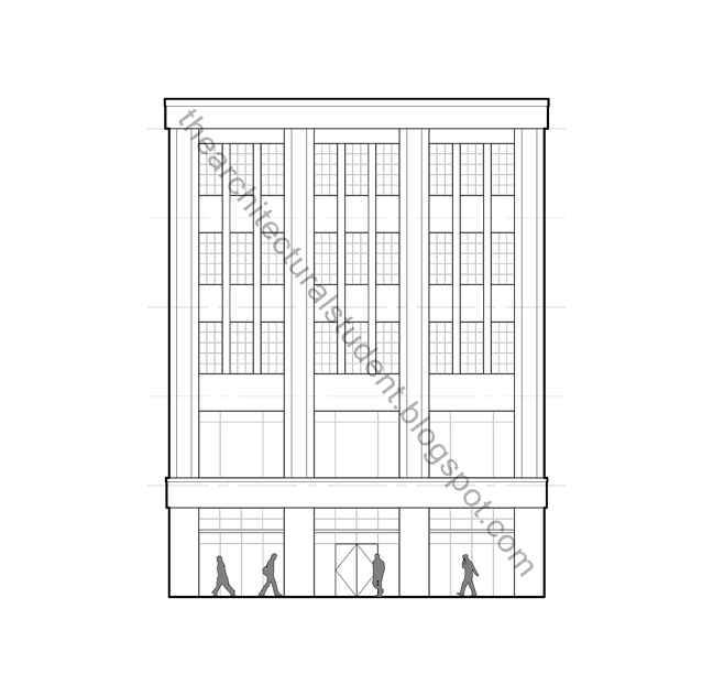
Print your elevation to be rendered to scale using whichever program you use. Take the print and put trace paper or vellum over it to trace the lines. You can have all the windows or doors already placed in the elevation or use it as a background to help you play around with your design. If you don't have a scaled drawing, either start drafting them, or freehand a sketch of them will work just as well.

At this point you should be familiar with creating an elevation from plans or from your head. If you are still starting to conceptualize your building's exterior, create a rough version of your facade either on the computer or on the paper. It is good to put in floor heights (dashed) with heights, as well as any defining features you want to implement so anyone reviewing them with you can see your thinking. This will help you formulate window openings on the facade. Be sure not to forget how thick your floors will end up being so don't make your windows too tall, unless of course, that is your intention.


Tracing

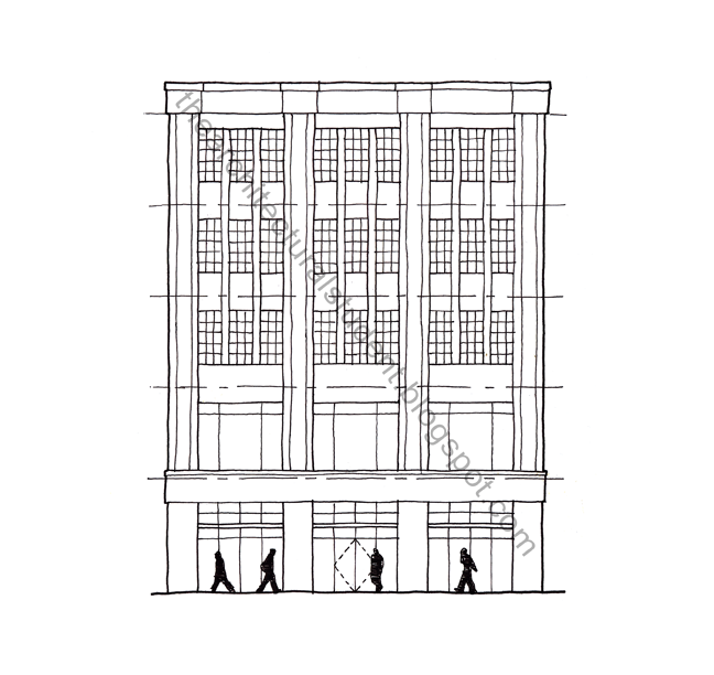
CAD Hand Tracing (on trace)
Tape your original down on two opposite sides to keep it in place then tape your vellum or trace paper on the 4 corners. I say this only because I have had the paper I was tracing on rip, fold or even become misaligned. Now before you start tracing you need to decide whether or not you want to make a hard-lined (drawn with a ruler) or sketchy elevation. If you aren't doing a final drawing, go sketchy (no ruler) and it will be more artistic and much quicker. You can also hard-line only some of the lines, such as the ground plane, building boundary, or whatever you think would benefit the intent of your drawing.

When tracing or sketching you should ideally use 3 different pen thicknesses or at least 2 different pencil leads (click here for pencil lead help) depending on the detail you are going for, varying pressure on the pen or pencil will also give you different line thicknesses. Use different line weights to highlight the fenestration, overhangs, etc. within your building. When going sketchy, show your style, if you are going hard-lined, make sure your line weights look right. Going back over them again can be a waste of time. When using pen, use an edge that is made for pen, which will help with smudging.

For this drawing I used Pelikan Techno Liner Pens which are fairly cheap, come 8 in a pack (0.1mm - 0.8mm) and are great for sketching. I use them a lot when working on studio stuff. I used 0.1mm, 0.2mm, and a 0.5mm for this trace, however I think they don't make them anymore. I would instead recommend getting a set of Prismacolor Premiere Fine Line Markers as a bit of a higher quality substitute. You can use Pigma Micron Ink Pens as well. I find they work better on ink or drawing paper rather than on vellum or trace. I also used white trace paper which is much cheaper than velum and comes in 20 or 50 yard rolls. If you are new to architecture, you will use trace more than you could possible imagine.


Coloring

Pen trace with shading on front and color on back
After you have completed the tracing part it is time to color. Here is the trick, color on the back of the page. If you do, the color will be muted, the line work will be more readable and help reduce smudging. This will also help to mute loud colors, as well as give the color more of the paper's texture. To color I use either marker or colored pencil though I find marker to be much faster than pencil and easier to color consistently once you are use to it. A big collection of markers and/or colored pencils are recommended to make the process easier.

In this example I used Prismacolor Premier Double Ended Art Markers. Always take out the colors you might want to use and try them together on a piece of scrap of the same type of paper to see what they look like. Of course you can just shade the elevation rather than color it and call it done. When using marker, you can create the shading by making the colors darker under overhangs. Another way is to shade the elevation on the front using a gray marker and use the color on the back, this way the color and shading won't run together and help to define your facade. If you are using colored pencil you can blend the shading with the color on the back of the paper without and issue since colored pencil is actually wax, just remember you can't erase it too well. I suggest adding the shading last when using pencil, do whichever with marker, just be sure to let it dry before you move onto another color or they will smudge together. It is up to you to decide what you want the final product to be, so experiment.

CAD Sketch Layered over Color Trace
Layers: CAD Trace, Shadows, and Color
Another coloring trick is to color over your traced elevation using a separate piece of trace or velum (preferably use trace since the paper is much cheaper). If you use this method you can change the coloring of the elevations if you decide to, or you can also add more layers to it. For one final drawing I used 3 layers of color behind the original tracing of the elevation; the new building's color, building shading and street color. This way, the important colors are more vibrant than the less important colors like the trees in front of the building or on the street. Just be sure to place them behind the traced layer before scanning or before class. I use drafting tape to tape them together at the edges. I generally use this layering method if I think I might change the material or add to the elevation later. This method take a bit longer and aligning the pages together can become difficult. It is important to note that if you get a final sketch in pen and you are afraid of messing it up, use this technique to figure out how you want your building to look and you can scan it anyway and if you mess it up, you can always coloring another piece of trace rather then waste the time tracing the elevation all over again.

When coloring, I recommend coloring in the direction of the material. What I mean is that if your building is brick, color horizontally using the small tip in order to get the feel of brick. Do the same thing for which ever material you are using. While using marker, having a tissue or paper towel handy will help you blot up any pools of color left when you lift up the marker. You can also plan ahead and pick up the marker in a place where you want it darker. Ending where there is a shadow will also help you define the building facade further. Again, this is all about your personal style, so play around and figure out what works best for you.


Scanning
 
For whatever reason a scan looks even better than the original. I only have a 9x12 inch scanner yet I get great results blowing up the renders to triple their original size. The trick there is to scan the original at 150% or 200% the size which will get you a very clear scan.

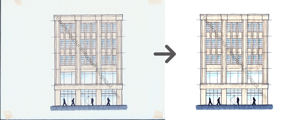
Once you have it scanned, play with it in Photoshop a bit to get the colors right or you can even leave it alone. I tend to edit my scans so the background becomes white. Be sure to save any changes to a new edited file so you always have the original scan to edit if you need to. Below is the before and after of my work. You can see the tape holding the layers of trace together in the scan keeping them aligned.


Original scanned elevation and after being Photoshop

I hope this post was helpful. It took me a while to figure it all out myself. If you have any comments, questions, or additional tips, feel free to comment below or send me an e-mail.

More Tutorials
 
You can also use pencil to create elevations. If you are new to the architecture field and are interested in knowing more about pencils, their different leads and types, check our the Architectural Student's Tutorial on Pencils and Leads. If you are interested in learning more about drafting techniques, please see our Hand Drafting Tutorial.