Friday, August 2, 2013

Tutorial: Hand Rendering Elevations

Hand Rendered Elevation
Elevations are an important part of architectural design. There are many ways to create elevations. You can use Sketchup, AutoCAD, Revit or one of the many other rendering programs out there. Creating a three dimensional model for elevations is very time consuming and creating a two dimensional elevations in AutoCAD also requires a lot of time and effort to get the right textures and line weights, much less taking the time to render them in Photoshop. Thus, the quickest way to create an elevation is to complete them by hand. This way you can also choose the detail of the rendering depending on the amount of time you have as well as work through elevation iterations to define your ideas without the hassle of computer rendering.

Since a studio or professional project involves the creation of scale plans in whichever program you use, you can use these primarily plans to create rough elevations of your proposed building. These rough elevations can also be used later to create final elevations of your building or if you have them already done, use them to create hand rendered elevations.


You will need
  • CAD Print (preferably printed to scale)
  • Drafting Tape or Drafting Dots
  • Vellum or Trace (white)
  • Pens (at least 3 thicknesses) or Pencils (at least two lead types)
  • Markers or colored pencils 
  • Scanner


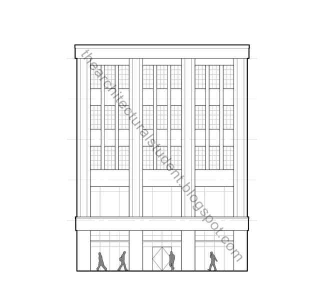
Original CAD Printout
Scale Printout

Print your elevation to be rendered to scale using whichever program you use. Take the print and put trace paper or vellum over it to trace the lines. You can have all the windows or doors already placed in the elevation or use it as a background to help you play around with your design. If you don't have a scaled drawing, either start drafting them, or freehand a sketch of them will work just as well.

At this point you should be familiar with creating an elevation from plans or from your head. If you are still starting to conceptualize your building's exterior, create a rough version of your facade either on the computer or on the paper. It is good to put in floor heights (dashed) with heights, as well as any defining features you want to implement so anyone reviewing them with you can see your thinking. This will help you formulate window openings on the facade. Be sure not to forget how thick your floors will end up being so don't make your windows too tall, unless of course, that is your intention.


Tracing
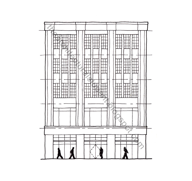
CAD Hand Tracing (on trace)
Tape your original down on two opposite sides to keep it in place then tape your vellum or trace paper on the 4 corners. I say this only because I have had the paper I was tracing on rip, fold or even become misaligned. Now before you start tracing you need to decide whether or not you want to make a hard-lined (drawn with a ruler) or sketchy elevation. If you aren't doing a final drawing, go sketchy (no ruler) and it will be more artistic and much quicker. You can also hard-line only some of the lines, such as the ground plane, building boundary, or whatever you think would benefit the intent of your drawing.

When tracing or sketching you should ideally use 3 different pen thicknesses or at least 2 different pencil leads (click here for pencil lead help) depending on the detail you are going for, varying pressure on the pen or pencil will also give you different line thicknesses. Use different line weights to highlight the fenestration, overhangs, etc. within your building. When going sketchy, show your style, if you are going hard-lined, make sure your line weights look right. Going back over them again can be a waste of time. When using pen, use an edge that is made for pen, which will help with smudging.

For this drawing I used Pelikan Techno Liner Pens which are fairly cheap, come 8 in a pack (0.1mm - 0.8mm) and are great for sketching. I use them a lot when working on studio stuff. I used 0.1mm, 0.2mm, and a 0.5mm for this trace, however I think they don't make them anymore. I would instead recommend getting a set of Prismacolor Premiere Fine Line Markers as a bit of a higher quality substitute. You can use Pigma Micron Ink Pens as well. I find they work better on ink or drawing paper rather than on vellum or trace. I also used white trace paper which is much cheaper than velum and comes in 20 or 50 yard rolls. If you are new to architecture, you will use trace more than you could possible imagine.


Coloring
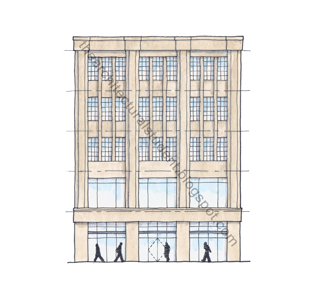
Pen trace with shading on front and color on back
After you have completed the tracing part it is time to color. Here is the trick, color on the back of the page. If you do, the color will be muted, the line work will be more readable and help reduce smudging. This will also help to mute loud colors, as well as give the color more of the paper's texture. To color I use either marker or colored pencil though I find marker to be much faster than pencil and easier to color consistently once you are use to it. A big collection of markers and/or colored pencils are recommended to make the process easier.

In this example I used Prismacolor Premier Double Ended Art Markers. Always take out the colors you might want to use and try them together on a piece of scrap of the same type of paper to see what they look like. Of course you can just shade the elevation rather than color it and call it done. When using marker, you can create the shading by making the colors darker under overhangs. Another way is to shade the elevation on the front using a gray marker and use the color on the back, this way the color and shading won't run together and help to define your facade. If you are using colored pencil you can blend the shading with the color on the back of the paper without and issue since colored pencil is actually wax, just remember you can't erase it too well. I suggest adding the shading last when using pencil, do whichever with marker, just be sure to let it dry before you move onto another color or they will smudge together. It is up to you to decide what you want the final product to be, so experiment.

CAD Sketch Layered over Color Trace
Layers: CAD Trace, Shadows, and Color
Another coloring trick is to color over your traced elevation using a separate piece of trace or velum (preferably use trace since the paper is much cheaper). If you use this method you can change the coloring of the elevations if you decide to, or you can also add more layers to it. For one final drawing I used 3 layers of color behind the original tracing of the elevation; the new building's color, building shading and street color. This way, the important colors are more vibrant than the less important colors like the trees in front of the building or on the street. Just be sure to place them behind the traced layer before scanning or before class. I use drafting tape to tape them together at the edges. I generally use this layering method if I think I might change the material or add to the elevation later. This method take a bit longer and aligning the pages together can become difficult. It is important to note that if you get a final sketch in pen and you are afraid of messing it up, use this technique to figure out how you want your building to look and you can scan it anyway and if you mess it up, you can always coloring another piece of trace rather then waste the time tracing the elevation all over again.

When coloring, I recommend coloring in the direction of the material. What I mean is that if your building is brick, color horizontally using the small tip in order to get the feel of brick. Do the same thing for which ever material you are using. While using marker, having a tissue or paper towel handy will help you blot up any pools of color left when you lift up the marker. You can also plan ahead and pick up the marker in a place where you want it darker. Ending where there is a shadow will also help you define the building facade further. Again, this is all about your personal style, so play around and figure out what works best for you.


Scanning
 
For whatever reason a scan looks even better than the original. I only have a 9x12 inch scanner yet I get great results blowing up the renders to triple their original size. The trick there is to scan the original at 150% or 200% the size which will get you a very clear scan.

Once you have it scanned, play with it in Photoshop a bit to get the colors right or you can even leave it alone. I tend to edit my scans so the background becomes white. Be sure to save any changes to a new edited file so you always have the original scan to edit if you need to. Below is the before and after of my work. You can see the tape holding the layers of trace together in the scan keeping them aligned.
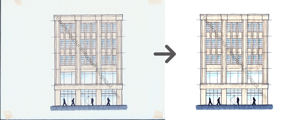

Original scanned elevation and after being Photoshop

I hope this post was helpful. It took me a while to figure it all out myself. If you have any comments, questions, or additional tips, feel free to comment below or send me an e-mail.

More Tutorials
 
You can also use pencil to create elevations. If you are new to the architecture field and are interested in knowing more about pencils, their different leads and types, check our the Architectural Student's Tutorial on Pencils and Leads. If you are interested in learning more about drafting techniques, please see our Hand Drafting Tutorial.

Monday, February 18, 2013

Jane Jacobs: The Life and Death of Great American Cities

5th Avenue New York City

In Jane Jacobs’ book, The Death and Life of Great American Cities, she discusses the particular nature of cities. The introduction focuses on how City Beautiful and the Radiant City differs from how cities truly work and how cities have suffered as a result of these ideals.


Part 1

In part one of her book she discusses city sidewalks at length talking about how safety, contact and how they work to assimilate children. She talks about three specific attributes that a street must have to create safety. A street must have a clear separation between public and private, watchful eyes of storekeepers, residents and those passing by and a sidewalk must have users on it fairly continuously. The prerequisite to surveillance is a “substantial quantity of stores and other public places sprinkled along the sidewalks.” This gives people a reason for using the sidewalks and also draws people past private places while keeping them well traveled. Storekeepers also help to keep order and peace while their establishments help to attract people and increase the numbers of people on the sidewalks. Lighting is also a very important characteristic of safety, though without effective eyes to see, crimes can occur in even well lighted areas.

The social structure of the sidewalk hinges partly on so called self-appointed public figures. One whom is in frequent contact with a wide circle of people such as storekeepers. They essentially enhance the  social structure by learning news at street level and spreading the information. She argues that this type of trust can not be established in community rooms. Rather, trust can be created with sidewalk contact and safety.

Jane Jacobs, 1962
The third function of the sidewalk is to assimilate children, that is to provide a non-matriarchy environment in which they can play. This section I found the most interesting when she compared the supposed ‘unsafe’ sidewalks with the presumably ‘safe’ parks. She referred to documentary maker Charles Guggenheim and his film investigating a St. Louis day-care where he discovered that roughly half of the children didn’t want to walk home afterwards, while the other half did. Those that left willingly lived in the old ‘slum’ streets whilst those that did not want to leave lived in the projects. Jacobs argued that those that lived in the projects had to deal with bullies while those that lived on the old streets were safe from extortion since those that lived in the projects had to pass by the presumably ‘safe’ parks in which had been removed from the public eye thus rendering them unsafe. Those living in the old streets had the opportunity to circumvent trouble unlike those that walk to the projects. She went on to talk about parks and how parks should posses four characteristics: intricacy, centering, sun, and enclosure. Intricacy is the reason thereby people use parks. Every park should have a center. Every park needs sun and buildings should be built up to the park without any windowless walls.

Part 2

In Part Two, Jacobs discusses that human beings live within a community that is characterized by many layers that seem chaotic and planners like Moses use deductive reasoning to find principles to dictate principles by which to plan cities thereby taking out the human portion of the equation. Urban renewal is the separation of uses like residential, industrial and commercial from each other thereby decreasing diversity of cities. Districts must serve mixed use functions to activate the streets at different times of the day. Blocks must be short to increase pedestrian path options and as a result enhance social and economic development. Buildings should also be of different ages so that they might be able to support businesses and residents of different wealth and also there should be a dense concentration of people to provide eyes on the street.


Jane Jacobs vs. Robert Moses


Book

Jane Jacobs' book, The Death and Life of Great American Cities, is a fantastic read and a great addition to your library. It is a truly insightful book on the inter-workings of cities.


Additional Information

The City Builder Bookclub - Great insight into each section of the book.

Friday, February 8, 2013

William H. Whyte - Social Life of Small Urban Spaces

The Social Life of Small Urban Spaces


William H. Whyte (1917-1999) was an American urbanist, organizational analyst, journalist and people-watcher.After writing a book about corporate culture, he started to research human behavior in urban settings. He wrote many books on the subject as well as created the following video on the social life of small urban spaces. Released in 1988, this witty and original film documents the research him and his researchers performed on social interactions within the city mainly looking at which spaces work and which ones do not. Starting with New York's Seagram Plaza the film analyzes why the space is so popular and compares them to other open areas in New York and other cities. This film is an engaging tour of the urban landscape and looks at how it can be transformed into a more habitable place for the urban dweller. The following video is a small fragment from his original documentary, Social Life of Small Urban Spaces, a must see for any urban designer or architecture student.


Additional Reading


After completing the documentary of the social life of small urban spaces, Whyte wrote a follow up book by the same name as the video, The Social Life of Small Urban Spaces. A great resource for urban research.


Thursday, February 7, 2013

Learn How To Create Colored Eagle Manipulation in Photoshop

Learn How To Create Colored Eagle Manipulation in Photoshop:

In this tutorial you will learn how to create colorful effect in Photoshop. We will use few stock images and shapes. We will go through the process how to add to an object light effects using basic Adobe Photoshop tools. Photoshop techniques that you’ll learn in this tutorial, you can use in creation of advertising posters or creating your own stylish photo effect.


You May Be Interested In The Following Posts
Final Image Preview


Stocks Used
Eagle Stock
Color Stock
Circle Shapes

Step 1 – Creating a new file

First create a new layer with w:2560px and h:1600px with color:000000 (black), name this layer as “Background”.

Step 2 – Place the image of bird

Open the image of bird and place in your document. Place the image in the middle of the document. Name this layer “Eagle”.


Step 3 – Preparing to the main effect

Create a new folder below the eagle image and name this folder “Lights effects”. We’ll create the main effect of this tutorial. Now choose brush tool (press b) with a soft round brush color e20000 and 1000px size paint in the middle of your document and use hard light to blend mode. Create a new layer below this layer and again use a soft round brush but now with 500px size and use color white. See the images below.


Step 4 – Add more color

Add more color to your document. Just create a new layer and use a soft round brush with 1000px color 832380 and place like the example below.


Step 5 – Creating circular shapes

We need more effects. Let’s create some circular shapes using the brush tool (b). Use a hard round brush with different sizes and colors to do this. After creating the circle press ctrl and click on the circle with the layer to create a circular selection. In a separate layer add a stroke (Edit >Stroke) with a lighter color and 4px or 5px. Return to the first circle shape and add a Filter>Blur>Gaussian blur, with 7px or 8px. Now, in the stroke layer add the same effect but now with 3px or 4px blur. Then marge both layers together. I created more circles and erased some areas. Look the images below.


Step 6 – Using liquify filter

Still in the lights effects folder create a new layer and use a yellow brush (b) then apply Filter>Liquify, and use forward warp tool to create a distorted shape like images bellow.


Step 7 – Adding more stock

Now I used a image of stock to add more lights effects (http://www.megaupload.com/?d=mmmm6fkg). Resize the image and change the layer mode to screen. Mask or erase some areas if necessary.


Step 8 – Creating splatter effect

Create a new layer above the eagle image then use any splatter brush to create this splatter effect. With your splatter brush paint over the eagle image, then press ctrl+click in this splatter layer to load a selection. Go to eagle image and press ctrl+c to cut and ctrl+v to paste this selection in a new layer. Now you can delete the original splatter layer, we do not need this layer.


Step 9 – Creating circular line shape

Create another layer above the eagle image. I created a circular line shape to do this simple effect. You can download this pack containing the shapes here (http://www.megaupload.com/?d=73gm7gs1). Now, just draw a shape like the image below. I use color #ff006c with overlay mode and 15% opacity.


Step 10 – Creating abstracts shapes

Create another layer above lights effects folder. Time to create some abstracts shapes. In this step I used some renders stock then I simply use liquify tool to distort the renders (Filter>Liquify>Forward warp tool). I don’t remember where I found the stock renders, but you can easily find these stock in Devianart. See below how were the renders after liquify tool. Use hue saturation (ctrl+u) to adjust the colors if necessary and burn tool (o) to darken the colors.


Step 11 – Apply a light effect on the wings

Now I create another layer above the eagle image. I will apply a light effect on the wings. To do this i draw i line with pen tool (p) and apply a layer style as you can see below, use outer glow with color #ab023a and let others settings standard. Then to finish the effect i apply a Filter>Blur>Motion blur, angle 0 and 10px or 15 px. See image below as reference. Do the same in the other wing.


Step 12 – Creating more lines

Create another layer and use pen tool (p) again to create more lines, but this time without layer style applied. Just use white color and choose simulate pressure. Choose a hard round brush 2px then press (p), right clickselect simulate pressure and hit OK.


Step 13 – Creating pink circles

I create in a new layer more pink circles and then I apply a Gaussian blur effect (Filter>Blur>Gaussian blur) with 5px. Then I have grouped all this circles together. Use soft light to layer mode and reduce the opacity to 20% or 15%. See the image below again.


Step 14 – Adding typography

I just use Illustrator to create a simple typography. Use type tool in Illustrator and add Effect>3d>Extrude & bevel and use the standard settings as you can see below.


Step 15 – Last step – Adding additional effects

For the last step feel free to create additional shapes and effects. I just paint some blue small dots with brush tool (b) and also I create some triangular shapes and I put diagonal lines to finish this job.

Thats all folks, hope you all enjoy it.

Final Result: Colored Eagle Manipulation in Photoshop


Tuesday, February 5, 2013

How to skin retouch with photoshop


How to skin retouch with photoshop

Original Photo


Duplicate the background  and rename it to Layer 1.
Image 1

Go to Filter > Other > High Pass and set the Radius to around 4.5 pixels.
Image 2
Image 3

 the Blending Options for Layer 1 from Normal to Soft Light and uncheck the eye to make Layer 1 invisible for the next step.
Image 4

Duplicate the background image again and rename it to Layer 2. We’re creating an extra layer with an automatic smoothening underneath the skin, so pop it under Layer 1 and go to Image > Adjustments > Invert. Next go to Filter > Other > High Pass, set it to 4.5 pixels and for this layer change the blending options toOverlay. After doing this you can make Layer 1 visible again.
Invert
Image 5
Image 6
Image 7

As you’ll see the image will be just slightly blurred and smoothen out but not the edges. On Layer 1 continue retouching using the Elliptical Marquee Tool. Circle the areas inside the face that need quick fixing, go to FilterNoise > Median and max the pixels out to 100 pixels. To make the process faster, repeat process in all areas using Ctrl-F (Command F on the Mac). This is a shortcut to apply the last filter which just makes life so much easier for you. I would suggest applying the Median  as much as you can before you move on to the next step.
Image 8
Image 9
Image 10

Flatten Image and use the Clone Stamp Tool mixed with a Soft Brush with the Flow set to around 30% to manually select areas next to one another, blend it in as much as you can using this tool to make further improvements to the skin. (The Clone Stamp was used no more than 10 times in the example below to show you how smooth it can go).
Image 12
If you find that it is getting too smooth for your liking then its really up to you to take a step back, use less Clone Stamping and re-size the brush correctly. This is just a quick demonstration to give you guys an idea of how to quickly clear up skin, with more time, effort and of course accuracy you will get a much better result.
Image 13

This is an additional step that you don’t need to follow, I just threw it in to add that extra bit of to overall image. Go to Image > Adjustments > Shadow/Highlight, then set the amount of Shadow to 20% and the Highlight can be left on 0.
Image 14

Image 15
via: http://photoshopland.com