Tuesday, November 8, 2016

What's New in New Document Dialog in Photoshop CC 2017 (Video)

What's New in New Document Dialog in Photoshop CC 2017

In this quick tip, I will give you a brief overview of what's new in Photoshop's File > New dialog. In short, there are new things like PSD layered templates, backgrounds and video clips which you can download for free from Adobe Stock and start using them right away.

Video tutorial

Here is my video recording with an overview of most important features in New Document dialog in Photoshop CC 2017.


Product used in this tutorial:
Adobe Photoshop CC 2017

Reference:
New features summary | Photoshop CC 2017


Sunday, September 25, 2016

Books: Starting your Architecture Library

Every architectural reference library has to start somewhere. Here is a list of the best architecture books to start your collection with.

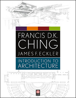
Introduction to Architecture

Francis D. K. Ching

Introduction to Architecture presents the essential texts and drawings of Francis D. K. Ching for those new to architecture and design. With his typical highly graphic approach, this Ching text surveys the design of spaces, buildings, and cities in an easy to understand graphic format. Readers will explore the histories and theories of architecture, design elements and process, and the technical aspects of the contemporary profession of architecture.

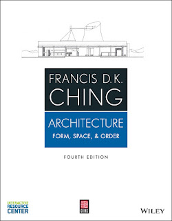
Architecture: Form, Space, & Order 

Francis D. K. Ching

For over forty years, the Francis Ching's beautifully illustrated Architecture: Form, Space, and Order has served as the classic introduction to basic architectural design vocabulary. The updated and revised Fourth Edition features the fundamental elements of space and form and is designed to encourage critical thought in order to promote a more evocative understanding of architecture.


Analysing Architecture


In its fourth edition, Analysing Architecture has become internationally established as the best introduction to architecture. Though primarily aimed at those wishing to become professional architects, it had much to offer those in architecture related disciplines. With lots of illustrations from his own notebooks, the author, Simon Unwin dissects architecture from around the world and all periods of history to explain underlying architectural design strategies and shows how drawings may be used as a medium for analysis.

Vitruvius: The Ten Books on Architecture


The oldest and most influential book ever written on architecture, The Ten Books on Architecture by Vitruvius has served as a guide to Bramante, Michelangelo, Palladio, Vignola, and countless others. It describes the classic principles of symmetry, harmony, and proportion as well as the ancients' methods, materials, and aesthetics. Authoritative translation by a distinguished Harvard professor.

Architectural Graphics

Francis D. K. Ching

Architectural Graphics is the classic bestselling reference by one of the leading authorities on architectural design drawing, Francis D.K. Ching. If you aren't familiar with him, any book by him is a must have. Now in its sixth edition, this essential guide on architectural drawing offers a comprehensive introduction to using graphic tools and drafting conventions to translate architectural ideas into effective visual presentations. The entire book is illustrated by Ching and his distinctive drawings to illustrate various topics effectively.


Sunday, May 29, 2016

Must See Architecture Films


Louis Kahn


My Architect: A Son's Journey is a documentary film by Nathaniel Kahn on his father, Louis Kahn (1901-1974), detailing the architect's extraordinary career and his family legacy after his death. Click here for a detailed look.


The Urban Fabric


Urbanized is a documentary about the design of cities, which looks at the issues and strategies behind urban design and features some of the world's foremost architects, planners, policymakers, builders, and thinkers. Click here for a detailed look.


Industrial Design


Objectified is a look at the creative work behind everything from toothbrushes to tech gadgets. It's about the designers who re-examine, re-evaluate and re-invent our manufactured environment on a daily basis. Click here for a detailed look.


Architecturally Beautiful


Inception is a contemporary film where dreams within dreams can be manipulated by "architects" who can construct an imaginary reality in order to get into someone's subconscious. Just imagine being able to create environments just using your mind as the resource and ignoring physics and the reality of building in the corporeal world.


Spirit of the Rural Studio


The documentary, Citizen Architect: Samuel Mockbee and the Spirit of the Rural Studio, follows architecture students as the cross the threshold of poverty to create a better world through the sense of community. This Rural Studio spirit creates a better world through architecture, not just structure. A powerful and memorable documentary about the lives of people in need.


The Fall of Public Housing


The Pruitt-Igoe Myth is a 2011 documentary film detailing the history of the Pruitt–Igoe public housing complex in St. Louis, Missouri, and the eventual decision to implode the entire complex in 1976. This documentary argues that the violent social collapse within the Pruitt-Igoe complex was not due to the demographic composition of its residents, but was a result of wider, external social forces, namely the declining economic fortunes of St. Louis and the resulting impact upon employment opportunities. Some can also argue that the fabric of a city neighborhood was also missing from the complex creating a unsafe sense of place. Refer to Jane Jacobs book, The Death and Life of Great American Cities.

Must See Architecture Films


Louis Kahn


My Architect: A Son's Journey is a documentary film by Nathaniel Kahn on his father, Louis Kahn (1901-1974), detailing the architect's extraordinary career and his family legacy after his death. Click here for a detailed look.


The Urban Fabric


Urbanized is a documentary about the design of cities, which looks at the issues and strategies behind urban design and features some of the world's foremost architects, planners, policymakers, builders, and thinkers. Click here for a detailed look.


Industrial Design


Objectified is a look at the creative work behind everything from toothbrushes to tech gadgets. It's about the designers who re-examine, re-evaluate and re-invent our manufactured environment on a daily basis. Click here for a detailed look.


Architecturally Beautiful


Inception is a contemporary film where dreams within dreams can be manipulated by "architects" who can construct an imaginary reality in order to get into someone's subconscious. Just imagine being able to create environments just using your mind as the resource and ignoring physics and the reality of building in the corporeal world.


Spirit of the Rural Studio


The documentary, Citizen Architect: Samuel Mockbee and the Spirit of the Rural Studio, follows architecture students as the cross the threshold of poverty to create a better world through the sense of community. This Rural Studio spirit creates a better world through architecture, not just structure. A powerful and memorable documentary about the lives of people in need.


The Fall of Public Housing


The Pruitt-Igoe Myth is a 2011 documentary film detailing the history of the Pruitt–Igoe public housing complex in St. Louis, Missouri, and the eventual decision to implode the entire complex in 1976. This documentary argues that the violent social collapse within the Pruitt-Igoe complex was not due to the demographic composition of its residents, but was a result of wider, external social forces, namely the declining economic fortunes of St. Louis and the resulting impact upon employment opportunities. Some can also argue that the fabric of a city neighborhood was also missing from the complex creating a unsafe sense of place. Refer to Jane Jacobs book, The Death and Life of Great American Cities.

Wednesday, December 2, 2015

Gift Ideas for Architecture Students

Given the holidays are coming and people have been asking what I want for the Holidays, I figured I should post some gift ideas for your favorite architect.

Architecture Mug by The Unemployed Philosopher's Guild

The Great Architecture Mug

Perfect for the architect in your life. Architectural drawings of 10 famous buildings from classical to classic. Holds 10 oz. Microwave and dishwasher safe. 


Trust Me I'm an Architect

Trust Me I'm and Architect T-Shirt

What can I say, we architects are an odd bunch but we always like a good laugh. This T-shirt by ThisWear is designed and printed in the U.S. on 100% preshrunk cotton shirts by printer and heat treated to ensure the color-fastness and lasting durability.


A Moleskin

Moleskin Classic Large Plain Notebook (5" x 8.25")

This basic, yet classic Large Plain notebook is one of the best-selling Moleskine notebooks. This reliable travel companion, perfect for sketches, thoughts and passing notes, has a cardboard bound cover with rounded corners, acid free paper, a bookmark, an elastic closure and an expandable inner pocket that contains the Moleskine history. There are also many more Moleskin Notebooks to choose from.


Aluminum Scale

Alvin 2200M Series 12-Inch Triangular Architect Scale

Every architect needs a scale or 10. Aluminum scales are very cool and will be used quite often when creating drawings. A must for any architect.


Everything an Architect Need to Know Every Day

The Architecture Reference + Specification Book by Julia McMorrough

Most architectural standards references contain thousands of pages of details overwhelming architects since they need to know to know a great deal on any given day. The Architecture Reference & Specification Book contains vital information that's essential to planning and executing architectural projects of all shapes and sizes, in a format that is small enough to carry anywhere. It distills the data provided in standard architectural volumes and is an easy-to-use reference for the most indispensable and most requested types of architectural information.


rOtring Technical Pens with Mechanical Pencil

rOtring Tikki Fineliners (0.35, .5, .7), Pencil, Eraser and Lead Set

This set includes some of the best disposable technical pens on the market. Usually, an architect or artist will always start in pencil before anything is inked, so the mechanical pencil, leads and eraser rounds out this great gift. Pens have free ink technology for a constant, consistent line, and a metal-jacketed fibre-tip nib for superior template and straightedge drawing. They also use long-lasting, lightfast, water-resistant pigmented inks (not refillable). The pencil has a brass mechanism for precise lead advancement of the included high-quality hi-polymer lead. Lightweight plastic bodies with rubberized grips and triangular barrels offer superior comfort and won't slide on tilted tables. You can also buy the pens in 2-packs or as a set without the pencil. These are my favorite pens by far.


Architect's Reference Notebook


Archnotes Reference Notebook for Architects (6.5" x 8")

A notebook designed specifically for architects by architects and includes reference information inside the front and back covers. The bright white paper has a light gray 1/8" grid that is "barely there" so you have it when you need it, but it doesn't get in the way. The spiral binding allows it to lay flat so you don't have to hold the book open. Important reference information is printed on the inside covers - paper sizes, 8" modules, slope percentages, drawing set order, Masterformat divisions, and much more. Never forget your scale at the office - includes architectural scales - 1/16", 1/8", 1/4", 1/2". Made in the USA.


rOtring Rapidograph Refillable Technical 3-Pen Set

rOtring Radidograph Technical 3-Pen Set


3-pen set of high-precision technical pens with refillable ink reservoirs is perfect for College-level students or Professionals. Wear-resistant, hard chrome-plated thin tip allows exquisite detail work. Nib is crafted from stainless steel. Push-on sleeve provides easy access to ink helix and fast cleaning. Color coded barrel indicates line width. Refillable ink reservoir is ideal for frequent drawers. Fill from ink bottles available in multiple colors. Wear-resistant, hard chrome-plated thin tip allows exquisite detail work.

Sunday, November 8, 2015

Tutorial: Drafting Necessities

Drafting Leads


Since everyone uses leads with varying amounts of pressure and the need for depth in architectural plans and renderings resulted in the needs for many different types of leads. B Leads are darker and as you get to 9B they become more and more charcoal like. When starting to draft, always use an H, generally 4H to 9H. They are lighter in shade, with a harder lead that erases the easiest. Just be careful not to write/draw too hard, it will indent the paper resulting in issues with paper texture and eraser. You can also get a ghosting affect when shading.


Drafting leads can be expensive, so get a combo pack or buy a few different ones. F's tend to be crappy lead, so instead opt for an HB, F's work well for quick sketches though. If I am using only a few line weights in a drawing I will use a light 2H for the construction lines (very light hand pressure), a harder 2H for the smaller line weights (more hand pressure) a medium light 2H (a bit more pressure) and a 2B for dark linework. You can also use a harder 4H for an additional lighter line weight for the construction lines. Generally you need at least 3 line weights and as your drawing gets bigger, adding additional B leads will increase the detail and intensity of your drawing. For additional line weights, add a 4B, 5B or whatever works for you. Leads right next to each like a 2B and a 3B are only slightly different so jump leads by at least 2 or 3 to get more definitive line weights. Each lead you use will also have at least two line weights itself. If in doubt, test on scrap paper of the same kind of paper you are using before you start adding line weights to your final drawing.


Lead Holders (Clutch Pencil)


Lead Holder or Clutch Pencil

Leads are used with a lead holder, also referred to as a clutch pencil. It is much faster to have a few lead holders so you can have a different lead in each clutch pencil. If you can afford it, start with three lead holders and three types of leads or if you can't, a couple different leads and a holder will suffice. There are many to choose from. Some even have a rotating cover so you can select the lead in the holder making drafting easier. Others have colored caps to identify which one has which lead.

Leads


2mm Leads

Leads come in packs of 2, 12 or more. Be sure to choose your leads carefully and know which ones you are buying. I generally use 2H, HB, 2B and 4B at the very least but remember we are all different so pick what works for you. Try with drawing pencils first before you spend money on leads to what might work for your hand. Always use at least 3 lineweights and remember how far viewers will be away from the piece. Leads also come in different colors depending on what you will be working on.

Sharpeners


The leads can be sharpened with a Rotary Lead Pointer which is the quickest way. You can also use a small sharpener, a piece of sandpaper or even a scrap piece of paper. Some clutch pencils also come with a pencil sharpener built in the button. A lead sharpener has built in holes to set the lead length so you can either sharpen it to a point or a very sharp point. be sure to clean the lead after you sharpen it. A lead holder has a built in lead pointer pad, they get dirty fairly quickly, but you can get refills. A rag or an old towel works in a jamb if you're careful.

Lead Pointer - src


Erasers 

White Eraser

On vellum, a white eraser such as a Staedler Mars erases the best, however on paper, a Papermate Pink Pearl Eraser often can work the best. When you are working on the details of your drawing, it can be hard to erase so use an Erasing Shield. You simply put one of the holes of the shields over your drawing to protect it and erase through the shield.

Erasing Shield

Drafting Must Haves


Scale


Recommended list of things that every Architecture Student should never be without. Scale - Both Engineering and Architectural. You'll need either a parallel drawing boarda T-square and a drafting boardor drafting table with a parallel ruler or T-Square, one large and one small of both a 45 and 60 degree triangle. An adjustable triangle can also be helpful if you will be doing a lot of hand drafting. I have one of those drafting machine drawing boards which is great for rendering and drafting.

Drafting Triangles


Drafting with Pen


If you decide to draft with pen, a prismacolor or Sakura Micron pens are not design for drafting but are great for sketching and diagramming with. There are drafting pens out there. The refillable ones are very expensive while there are also cheaper disposable drafting pens. It is easier and cheaper to use pencil, but nothing beats a nice drafted ink line on velum.

Ko-I-Noor Rapidograph Drafting Pens
RoTring Tikky Graphic Fineliner


Hand Rendering Tutorial


Once you have learned about line weights using either pen or pencil, you can check out the Hand Rendering Elevations Tutorial. The tutorial is based on tracing computer generated elevations, which I generally do for class, however, it explains the different methods of coloring and layer colors using trace or velum which will be helpful for conceptual sketching and graphic conceptualization of your ideas.

Pen and marker on trace

Further Information


The best book to get for your architecture collection is Francis D. K. Ching's book, Architectural Graphics currently in its fifth edition. I have this book in my collection, It goes through leads, paper, and drawing technique in the first chapter. The rest of the book is how to draft architecturally. Plans, sections, elevations, perspectives, you name it, it has it. I use it for reference every now and again even now. Buy it from Amazon from a third party seller either 'New' or 'Like New' condition which will save you a bit of money. Always check seller reviews.


Pencil and Lead Tutorial


If you are new to the architecture field or drawing in pencil and are interested in knowing more about pencils, their different leads and types, check out my Tutorial on Pencils and Leads. In this tutorial, I explain different lead types, different pencils, their quality and the uses for each.

Saturday, September 26, 2015

Tutorial: Indesign Tips for Architecture Boards

Intro


Over the many years of creating architectural boards for school there are a few main issues I noticed while learning to create them. Scale was always the biggest issues with students showing a section, plan or rendering too small to be legible during their presentation. This is also true for vignettes or renderings outlining the building's concept. Being Consistent in the creation of your presentation is also important. When the boards come together they need to belong. Font sizes should also be consistent and drawings should be close to the same saturation. Being subtle is the best approach so watch your picture opacity. This will start to create Visual Interest within your boards. Using large Text with your concept words is a good way to reinforce them during your presentation and help tie things together. Knowing what software to use and how to use it is also important in order to create successful drawings and renderings. 

Scale


One issue that every architect and architecture student faces from time to time is drawing and picture size. If your drawings or pictures/renders are too small, how can your critics see what your are talking about? Pay careful attention and print out text font samples so you can see what might be readable. Ask a classmate what they used or what they think about yours. When doing final drawings, always check your lineweights. Many times I have seen drawings that either used too thick or too thin lineweights (click here for The Architecture Student's tutorial on Setting up Lineweights in CAD). Always know whereabouts your audience will be standing/sitting and create your boards such that they can clearly see the main ideas from there. Portfolios are much different so be sure to make everything big enough when it comes to presentation boards.

Consistency


Use the same size fonts for each type of text (i.e. title, board text and labels). You can set these fonts up either in character or paragraph styles. I use the paragraph style myself. It is pretty easy to set up and once you do, it makes editing and adding things that much quicker. It is also good to use some sort of color or graphic that creates a coordination and belonging between your boards.

Visual Interest


After you figure out font stuff, come up with an idea that will be a theme. A box behind your section titles is one way. Linear lines that connect boards together, or a background picture at a very low opacity are also great ideas. Chris P made the following tutorial on a quick and dirty background for his review boards. Make it your own, but he a bit subtle.


Photographs


Pictures of models, precedents or renderings are quite important to your concept, their opacity are just as important. Pictures generally are too dark and contrasting than you would like. I have seen it again and again on review and presentation boards. When pictures and renderings are more subtle or relaxed, the more pleasing the layout and concept. When I input a render, plan, section or picture, I automatically set the opacity to 90%. If the picture is especially dark, I will go to 85% or lower. Implying color rather than saturating it can make things blend together and be more soothing to the eye. Black shouldn't be at a 100% opacity unless it is your intent. Solid black also has issues when printing, saturating the paper possibly leading to paper wrinkles and can mark up the rest of your boards when you print. I generally use 90% or 75% depending on if its a section, plan, picture, etc. It is important that the boards work together, don't worry about colors changes but it is a good idea to continue to use the same diagram colors throughout to help with consistency and visual appeal.

Text


Text Size - src
Generally students end up making their test too small so be careful. Some things you don't want anyone to read from afar and some that you do. No one will read a paragraph from pretty far away so keep your large text your concept words and drawing/section titles. For text I generally keep it set to black. I also keep my text opacity at 95%, anything lower goes into grey, which can start to become difficult to read. Big fonts can also be at 25% or even lower. It comes out a light grey, easy to read and not overpowering. Play around with it and keep a theme of some sort.

More from the Architecture Student Blog


Additional information

A lot of the tips I've learned on computer rendering I read in Bradley Cantrell and Wes Michaels' book, Digital Drawing for Landscape Architecture: Contemporary Techniques and Tools for Digital Representation in Site Design. Even though it is for landscaping, it outlines the requirements and techniques for Photoshop rendering beautifully. Look for used or new books from an amazon seller since they are generally cheaper than Amazon even with shipping. Always be sure check seller reviews!


Examples

Check out our collection on Pinterest to get inspired.